The owner of Vintage Champage contacted me because he needed a new logo/mascot for Champagne Kælderen (CPH) and the upcoming Champagne Bodega.
Challenge
The challenge was to create a character and a a logotype that would create consistency between the two bars. While the main beverage served is champagne, the owner wanted a visual identity that makes it less exclusive and more inclusive for people who are no Champagne connoisseur.
Solution
A quirky champagne stopper and a typography that draws inspiration from fonts used on bottles with the fizzy drinks makes up the final result. By using symbols representing the different bars while using the same mascot as center piece the mascot was to be used on print and online content while the logotype was to be used as the main logo online and IRL.
The Mascot
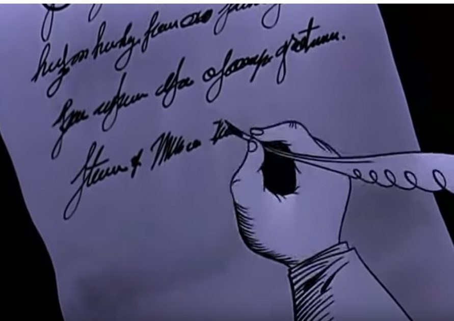
The inspiration for the Mascot came from the quirky animation style from “Man in space” by Disney (1955)
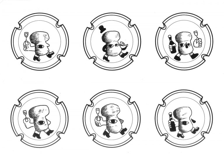
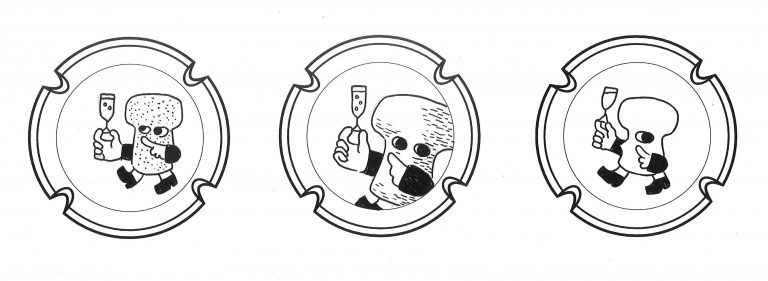
Plenty of mascot sketches were made in order to find a look that pleased the owner of Vintage Champagne the most.
Champagnekælderen: A delicate glass of champagne balance on the fingertips of the mascot, emphasizing that this was where it started.
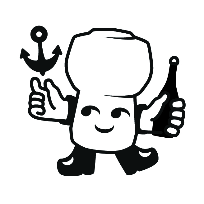
Champagnebodegaen: As he Bar was placed near Nyhavn in Copenhagen it was an obvious choice to use an anchor in order to imply its connection to the marine environment.
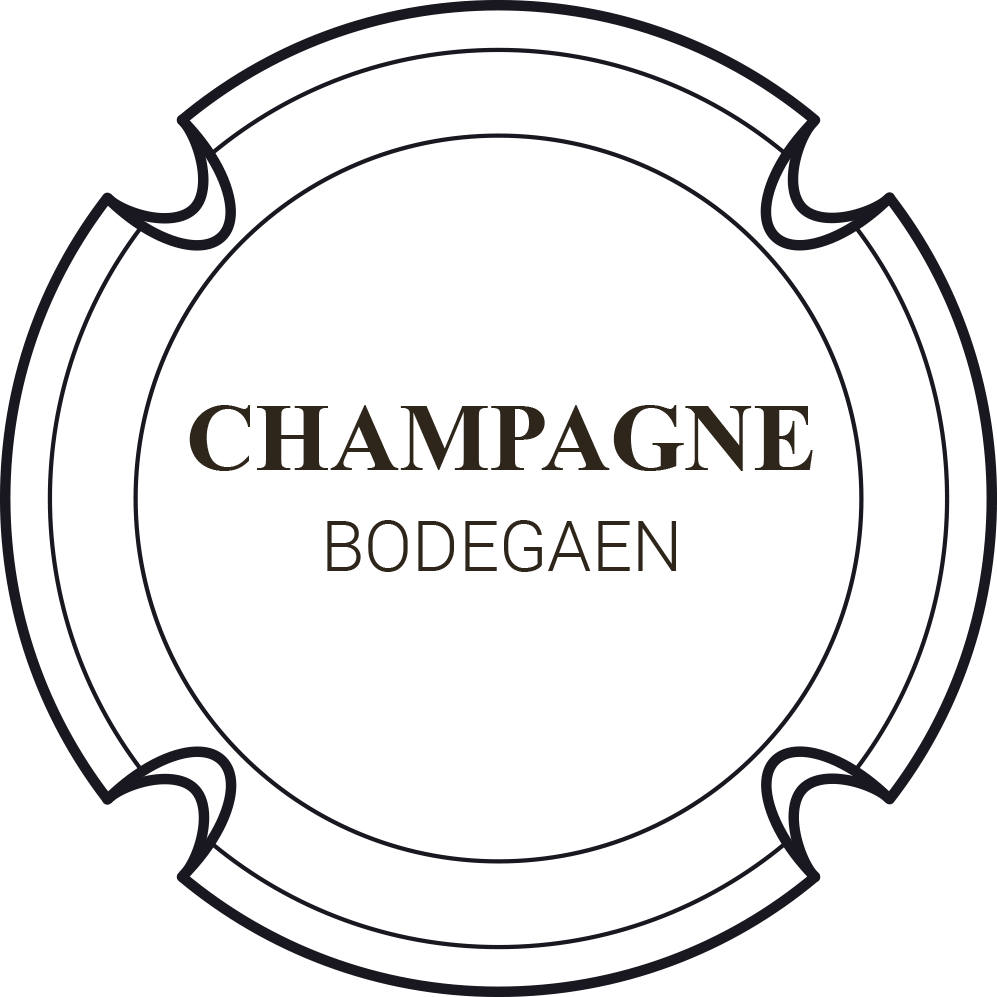
The Logotype
The combination of different kind of fonts used on Champagene bottles was the inspiration for the Logotype used when displaying the names of the different establishments.